The Challenges
My role focused on improving accessibility by fixing colour contrast issues and establishing a strong typographic hierarchy. I developed temporary style guide outlining accessible colour schemes and font usage, then conducted in-browser testing to ensure usability and compliance with accessibility standards.
My Role
UI/UX Designer · Accessibility Reviewer
Tools Used
Figma · Google Chrome DevTools
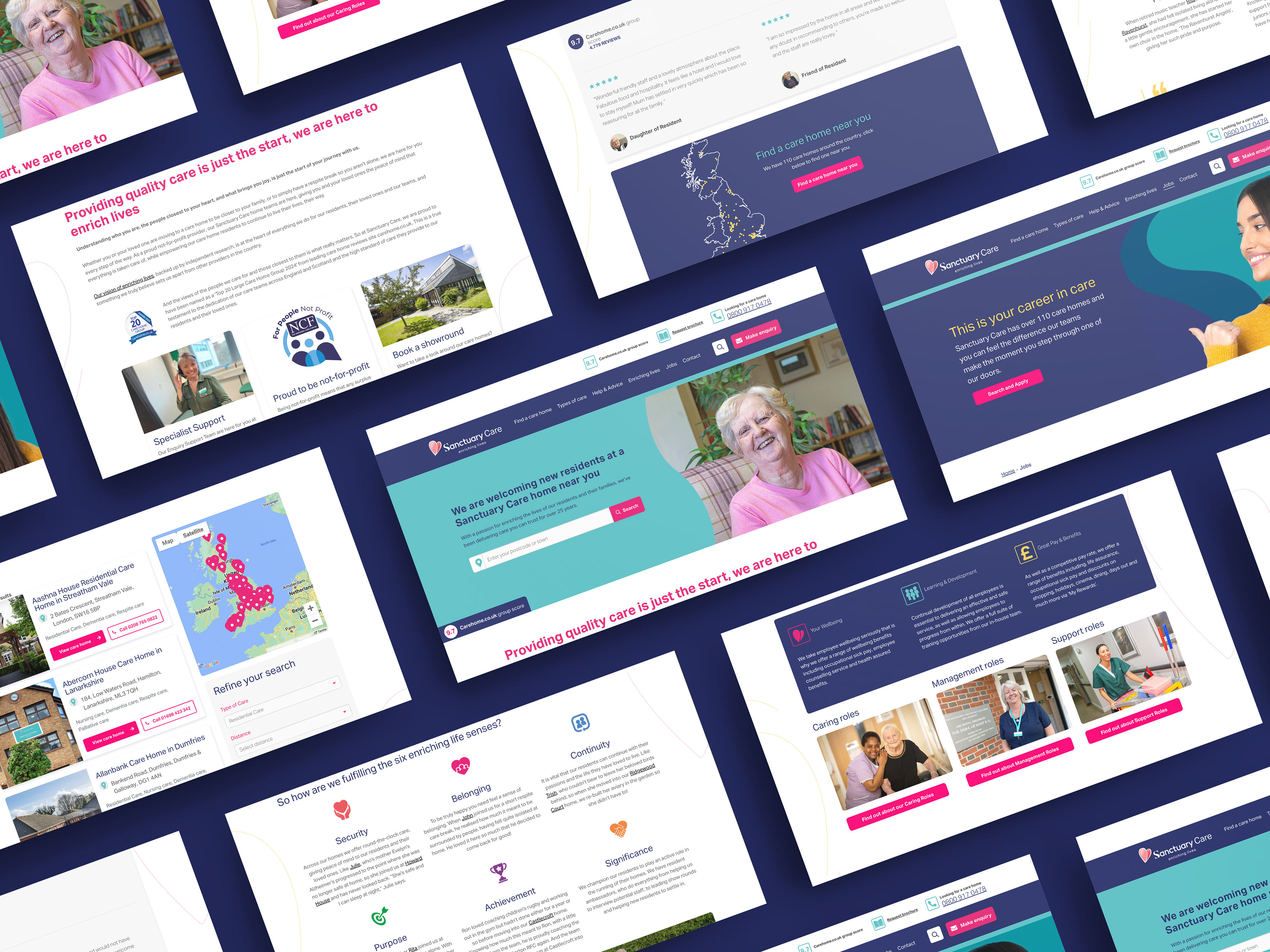
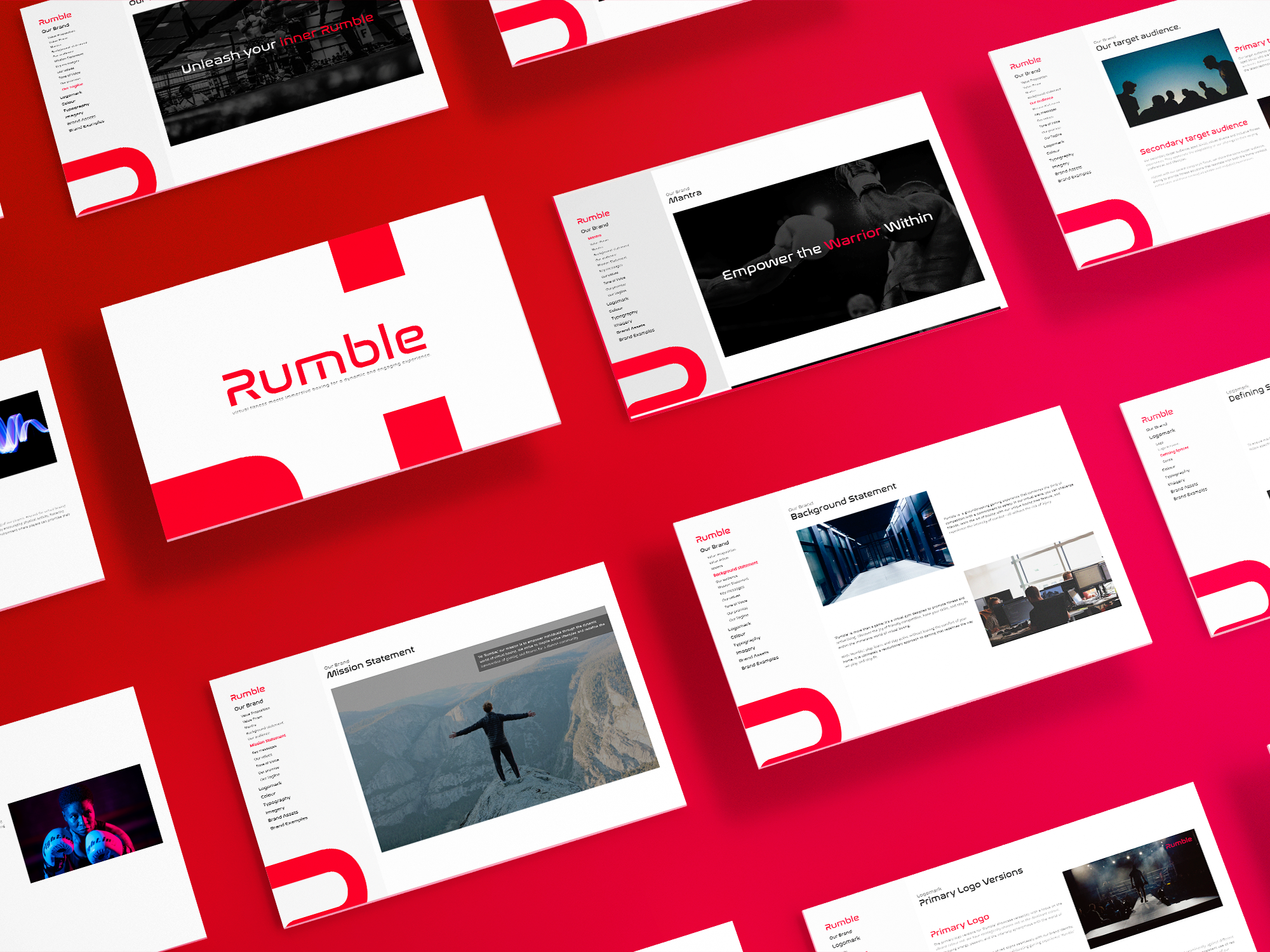
Sanctuary Care Website
The Issue
The client's website faced accessibility challenges, particularly concerning colour contrast, button states, consistency, and visual hierarchy, hindering user experience and accessibility compliance.
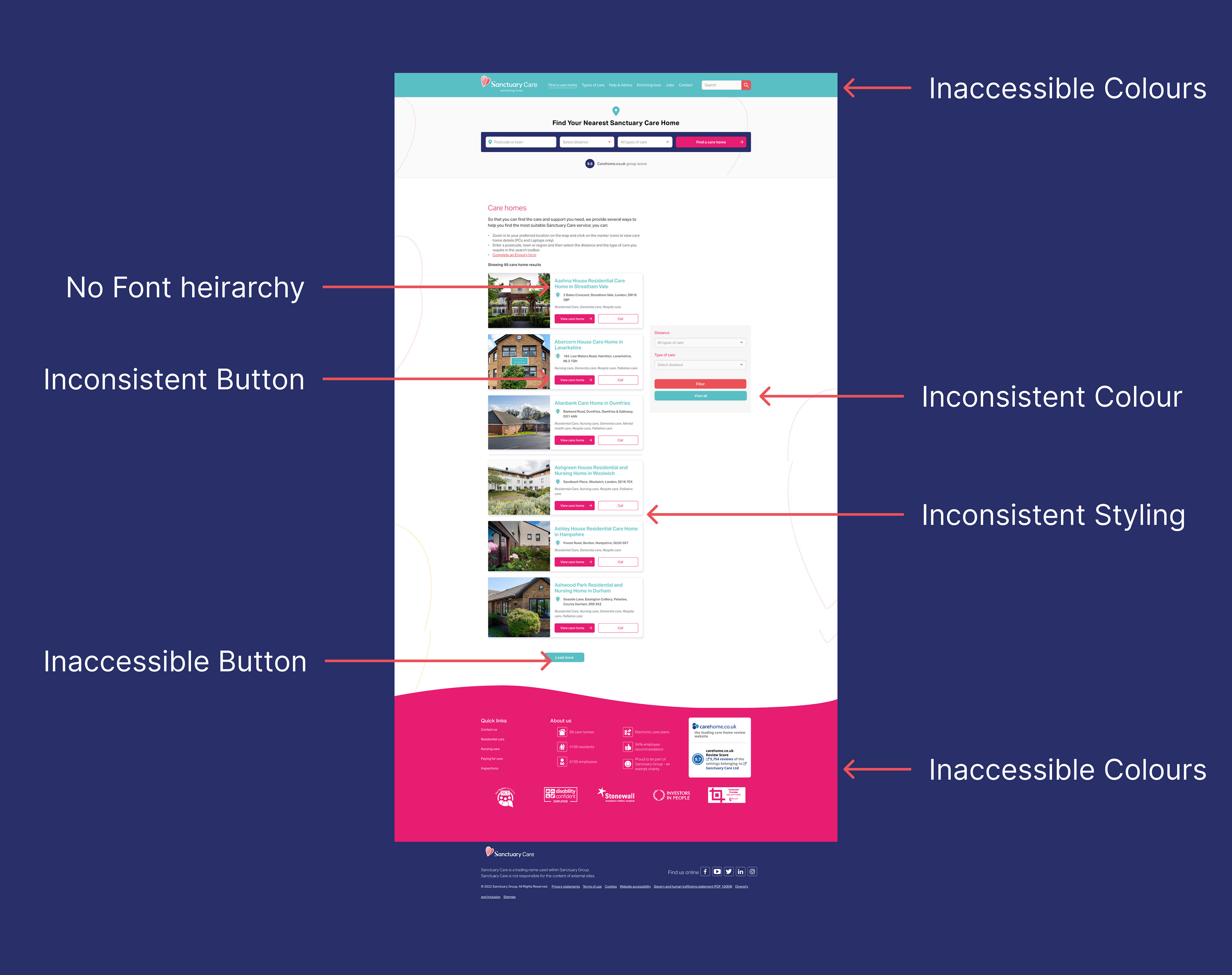
Sanctuary Care Website Issues
Setting up a style guide
Establishing a mini style guide, I documented new accessible colour schemes, font hierarchy, button states, drop shadow usage, and component specifications, serving as a reference for consistency and accessibility compliance.
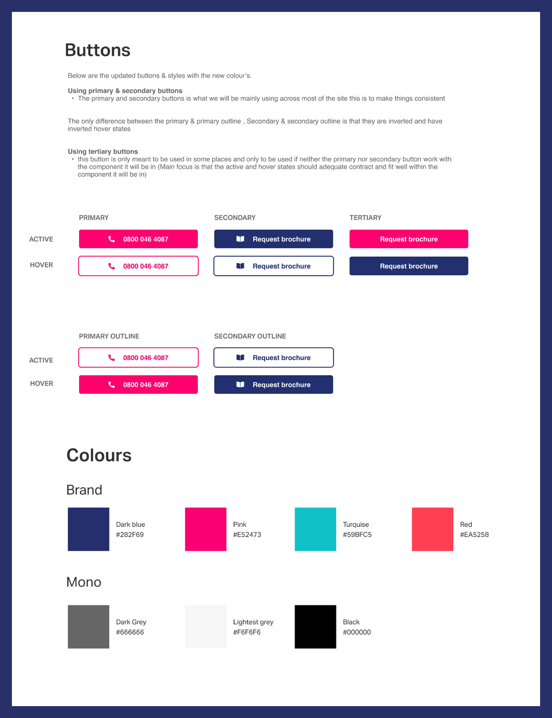
Colour Schemes and Buttons
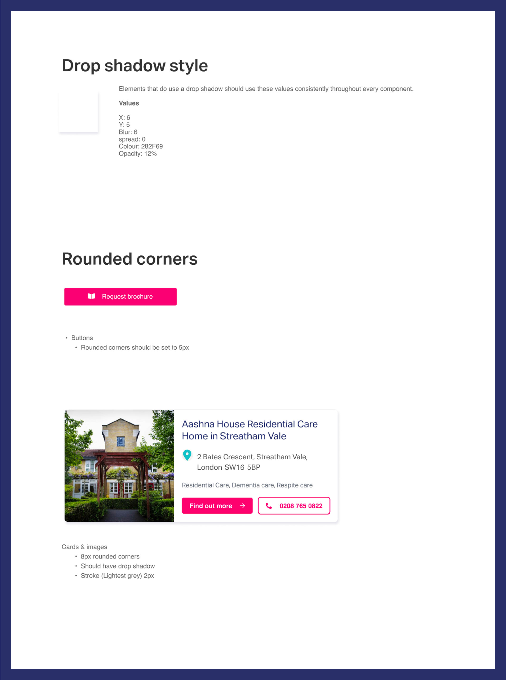
Fundamental Components
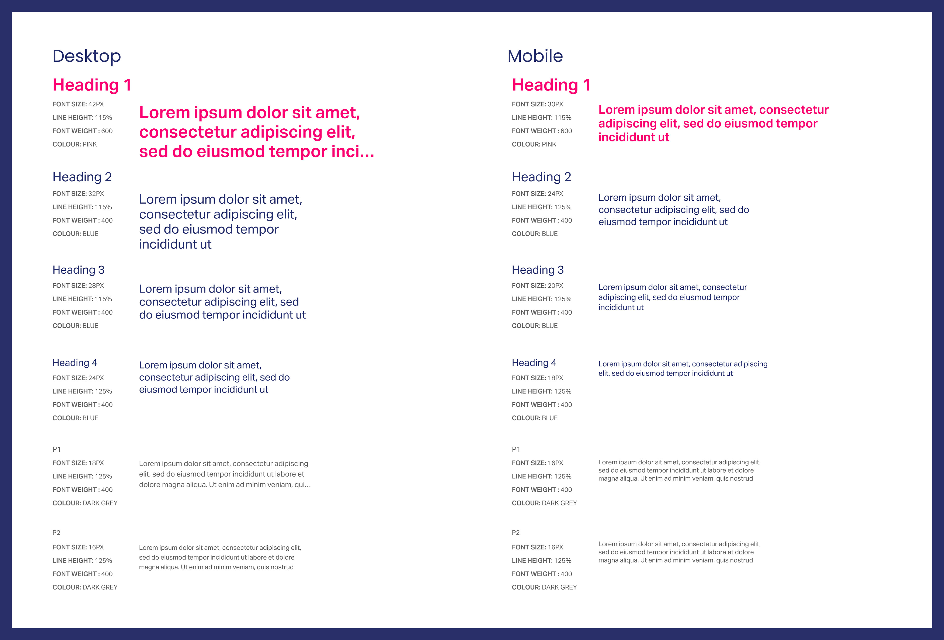
Desktop & Mobile Typescale
Testing & Collaboration
Given that this project didn't start from scratch and lacked Figma design files to verify the new colour scheme, I depended on the Chrome inspector to test colour schemes and font scales. Additionally, I collaborated closely with developers, ensuring they understood the changes I made to implement them effectively.
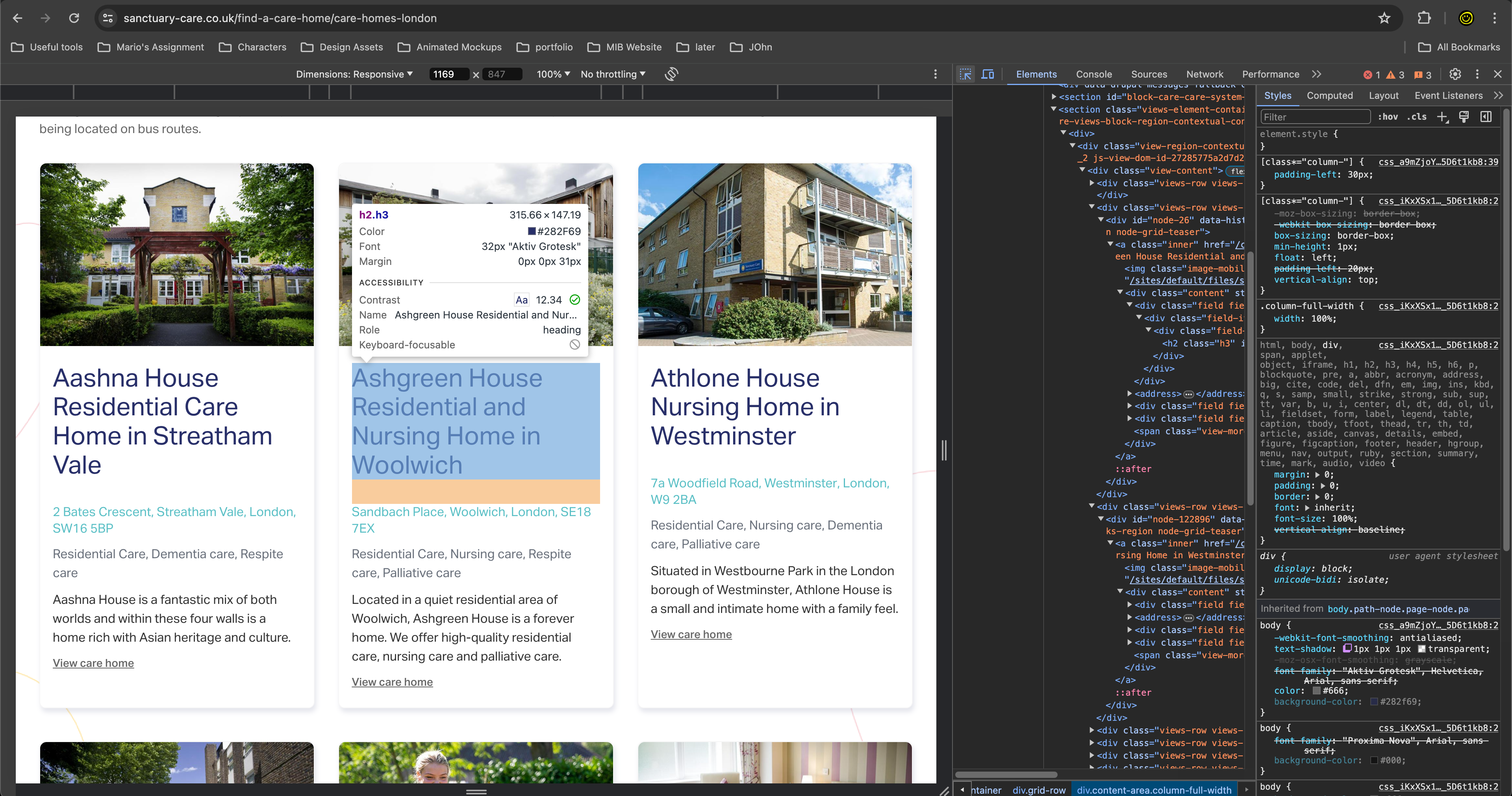
Inspecting Fonts
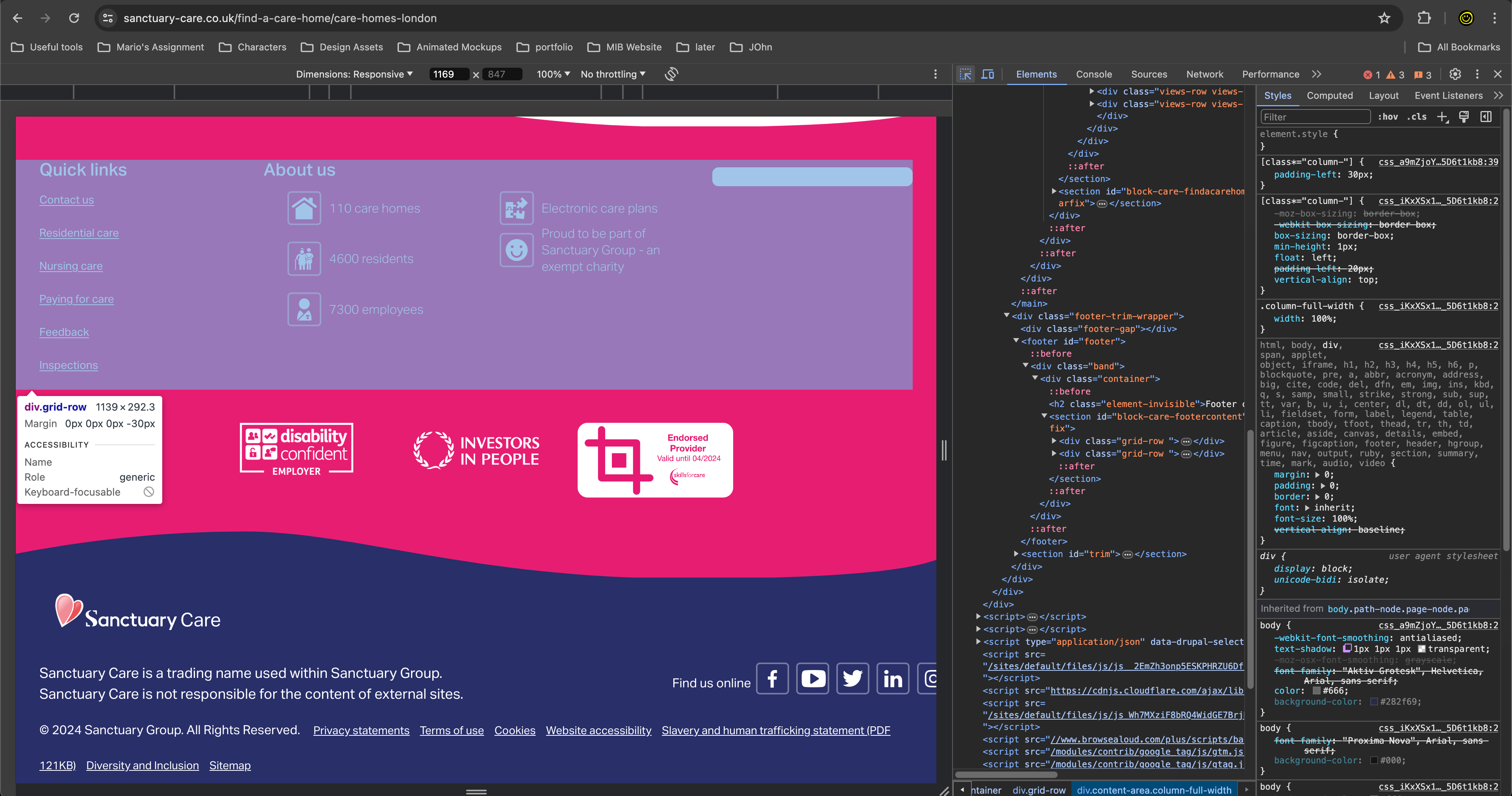
Inspecting Colours
Final Outcome
After implementing the guidelines and collaborating with developers, the final designs that were developed showcased improved accessibility, enhanced user experience, and maintained visual consistency across the website.
You can check out the website here: Sanctuary Care
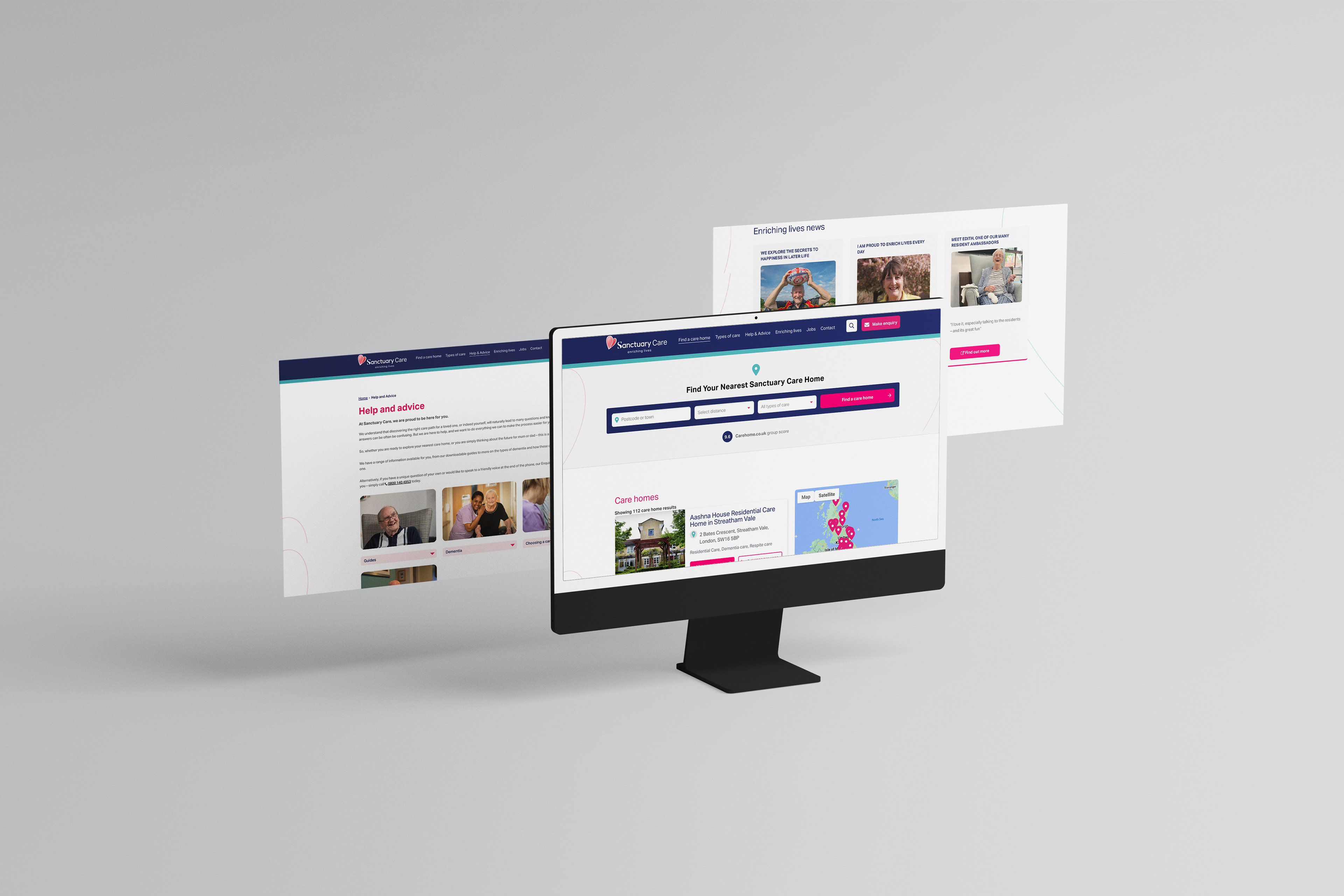
Sanctuary Care Website Updated
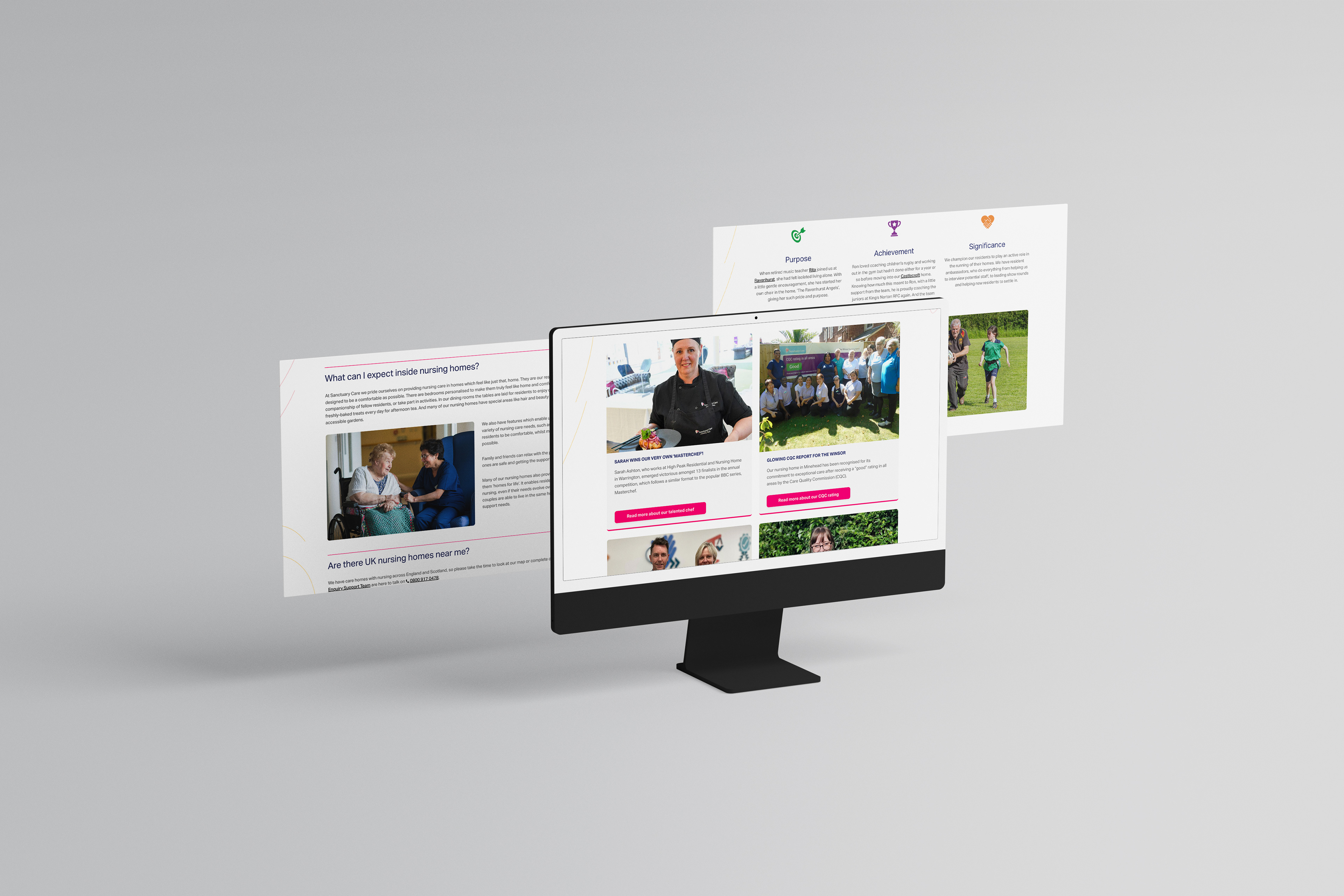
Sanctuary Care Website Updated
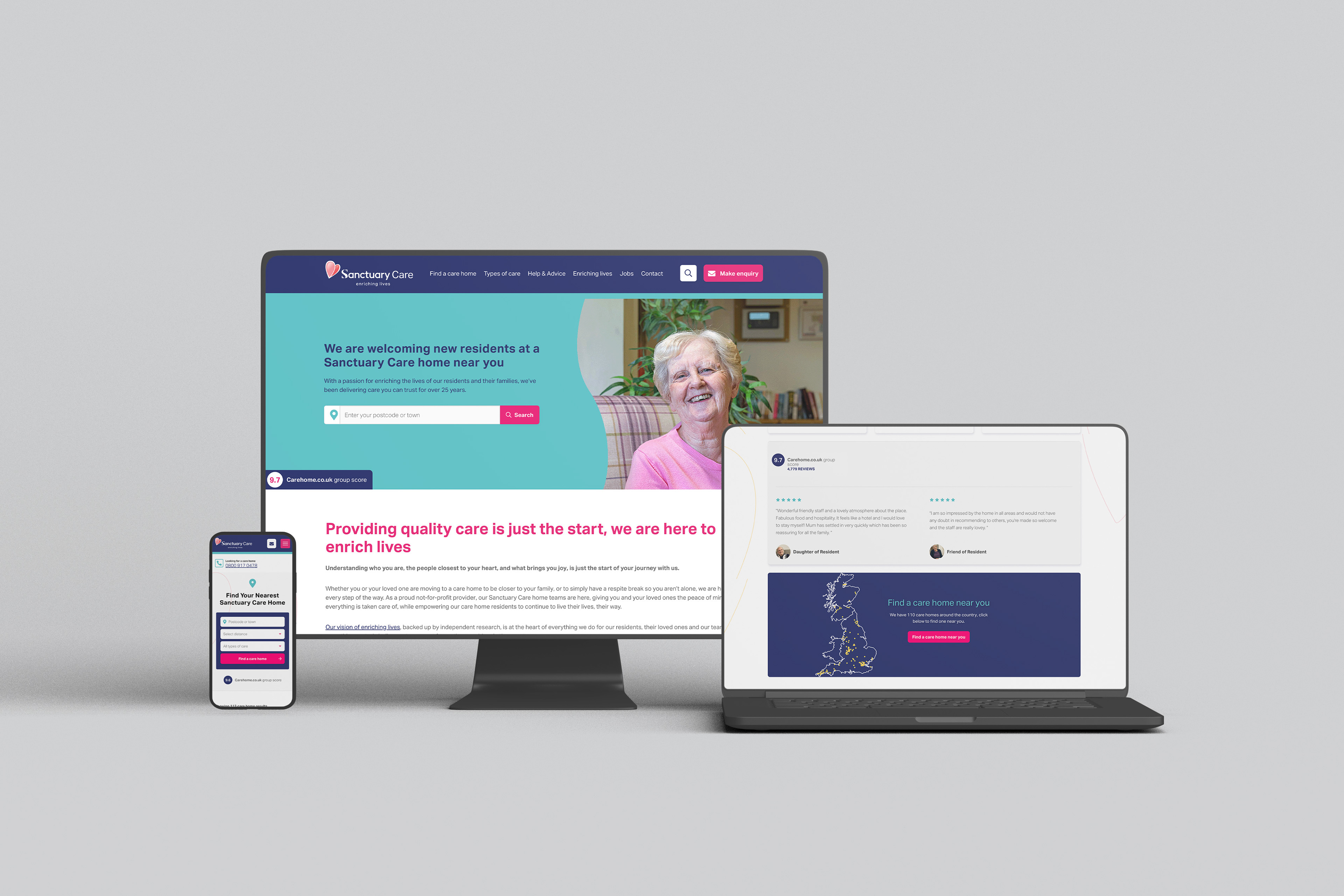
Sanctuary Care Website Updated
Reflection and Success
Meticulous planning and execution led to significant improvements in accessibility compliance, user experience, and visual consistency. Adjusting the colour palette notably enhanced usability, while structured guidelines ensured consistency and established a clear visual hierarchy. This approach highlights the importance of addressing accessibility concerns and effective collaboration between design and development teams.
This project goes to show as a designer we don't always start projects from scratch as this project was something I had to pick up on showcasing my adaptability skills.
This project goes to show as a designer we don't always start projects from scratch as this project was something I had to pick up on showcasing my adaptability skills.