The Challenges
Designing for a broad audience (18–64) meant creating two distinct poster and postcard sets — one for younger viewers, another for older adults. With six language versions, choosing the right font was key to ensure full character support and readability, while maintaining a consistent layout across all translations.
My Role
Print Designer · Graphic Designer
Tools Used
Illustrator · InDesign
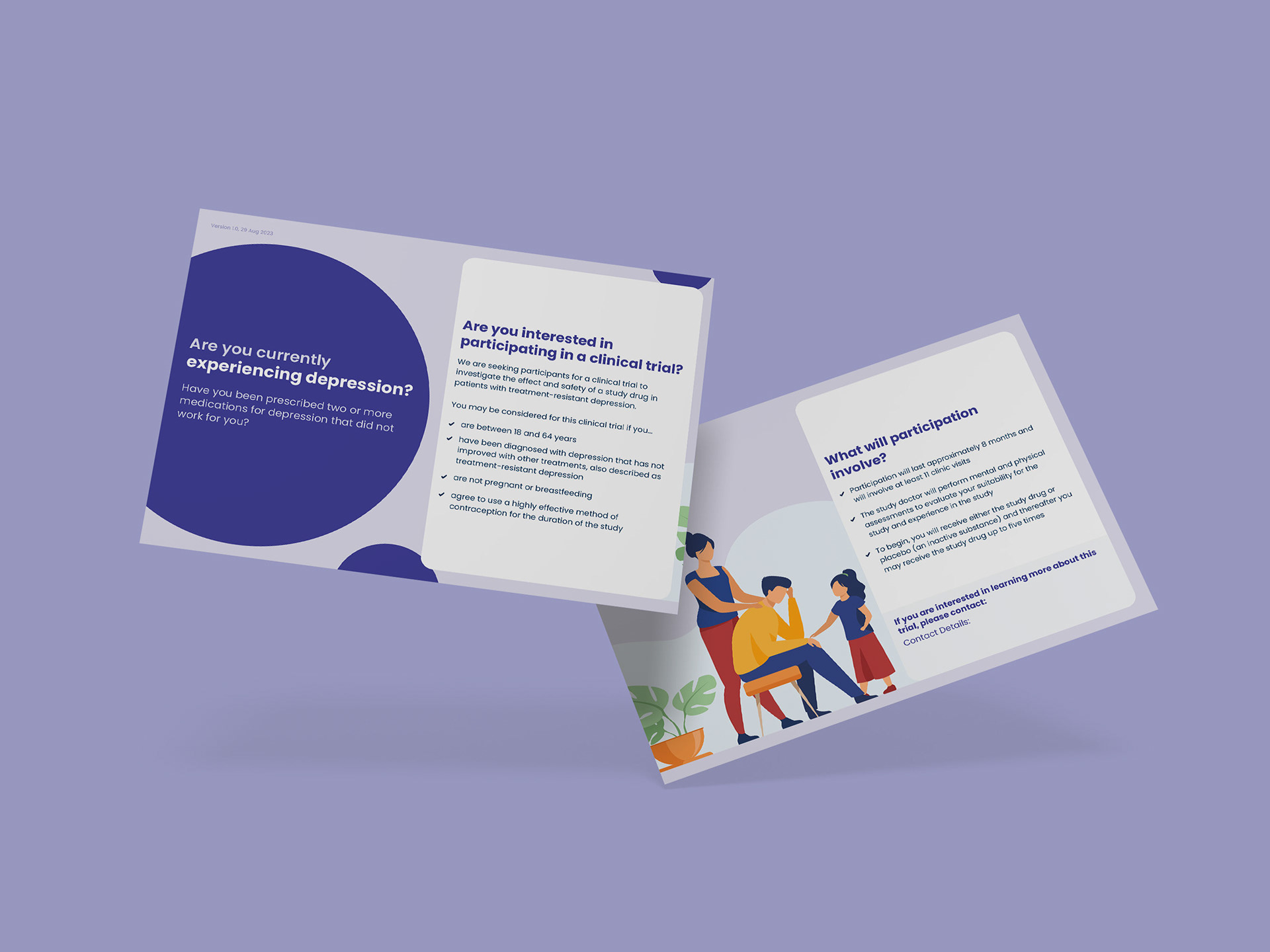
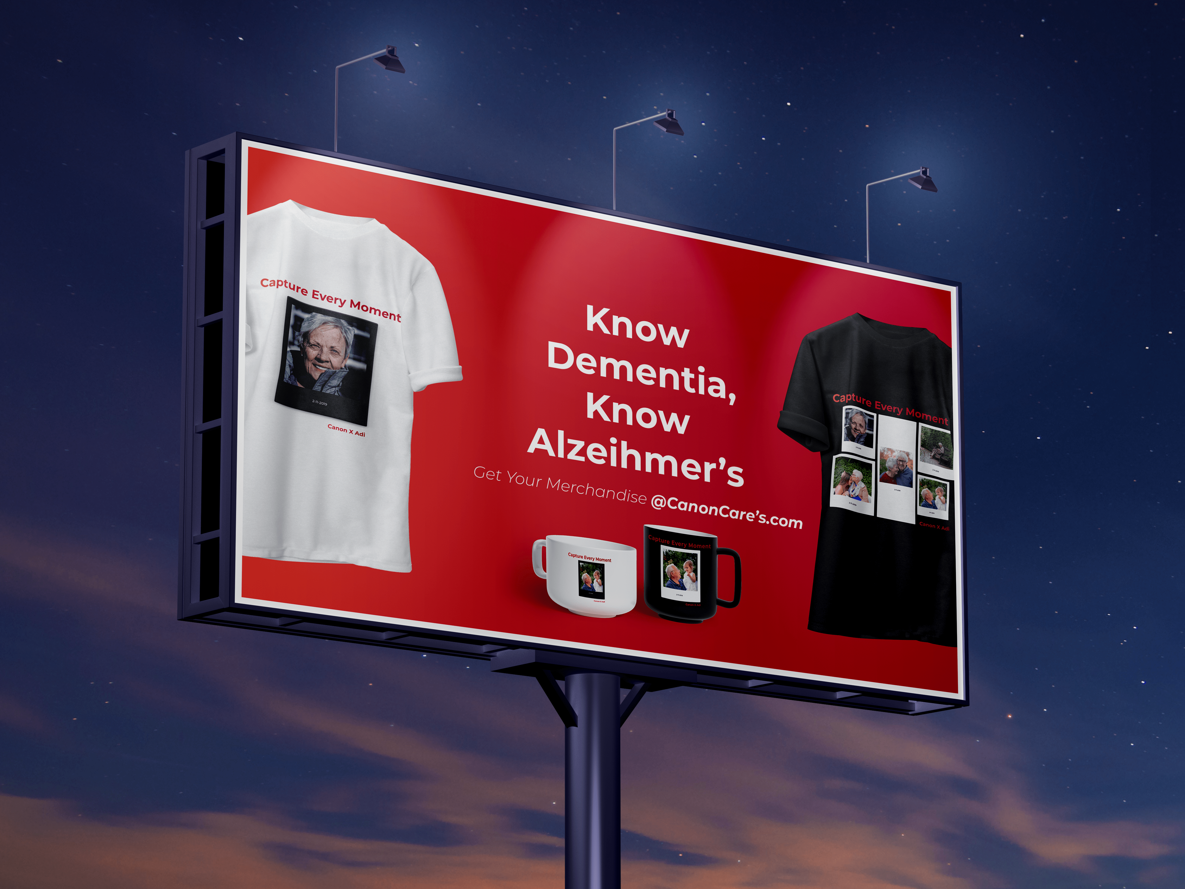
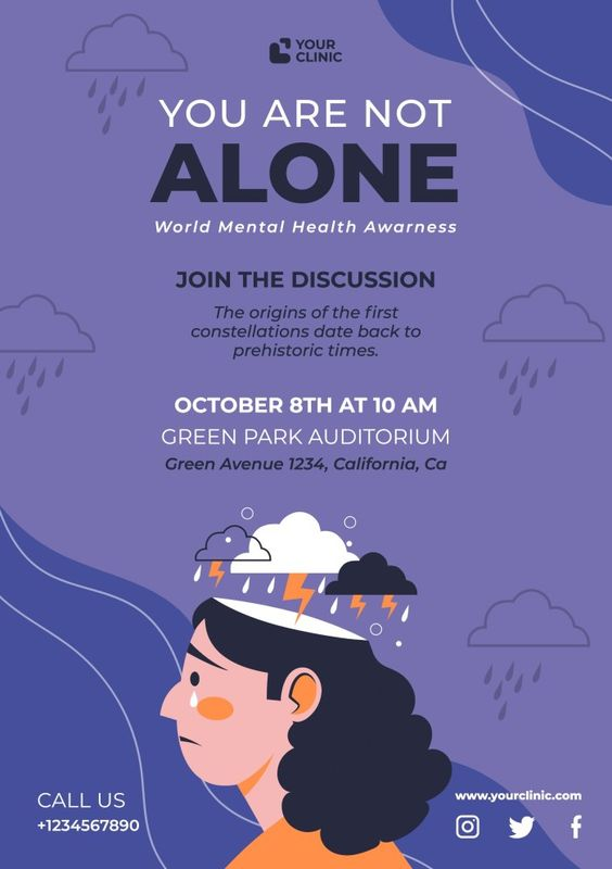
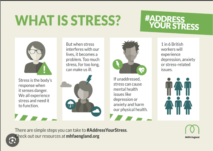
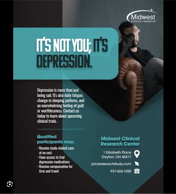
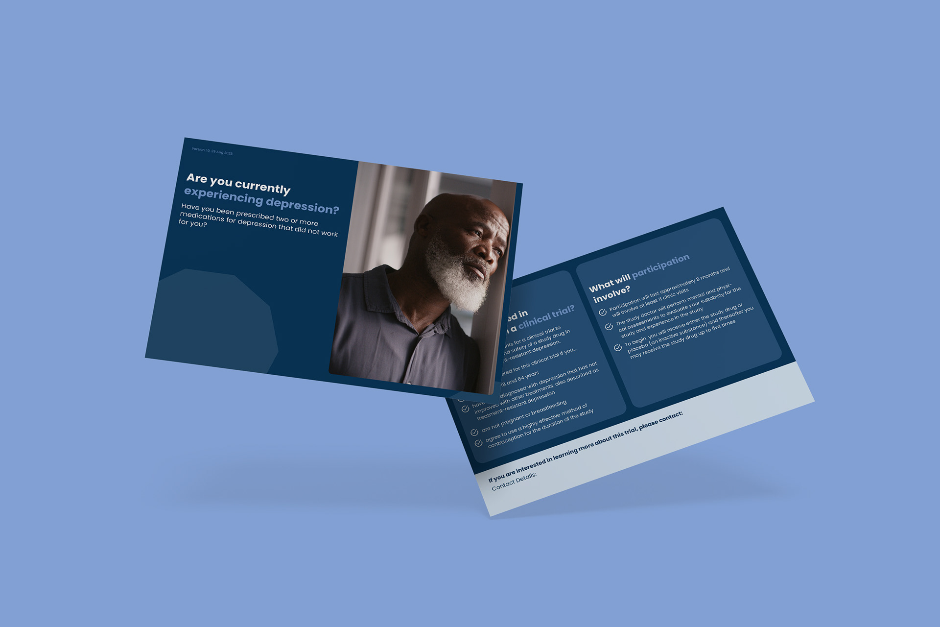
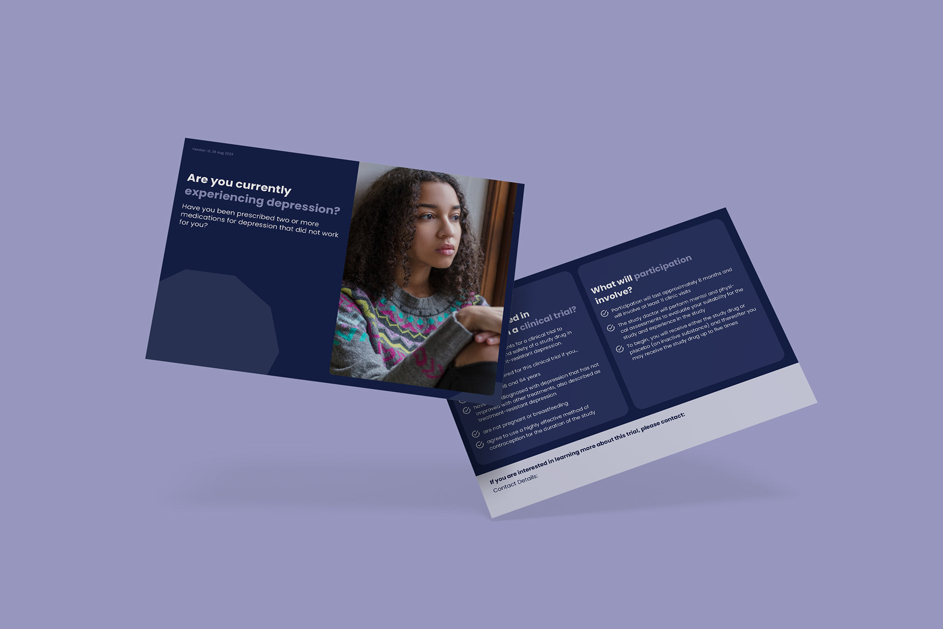
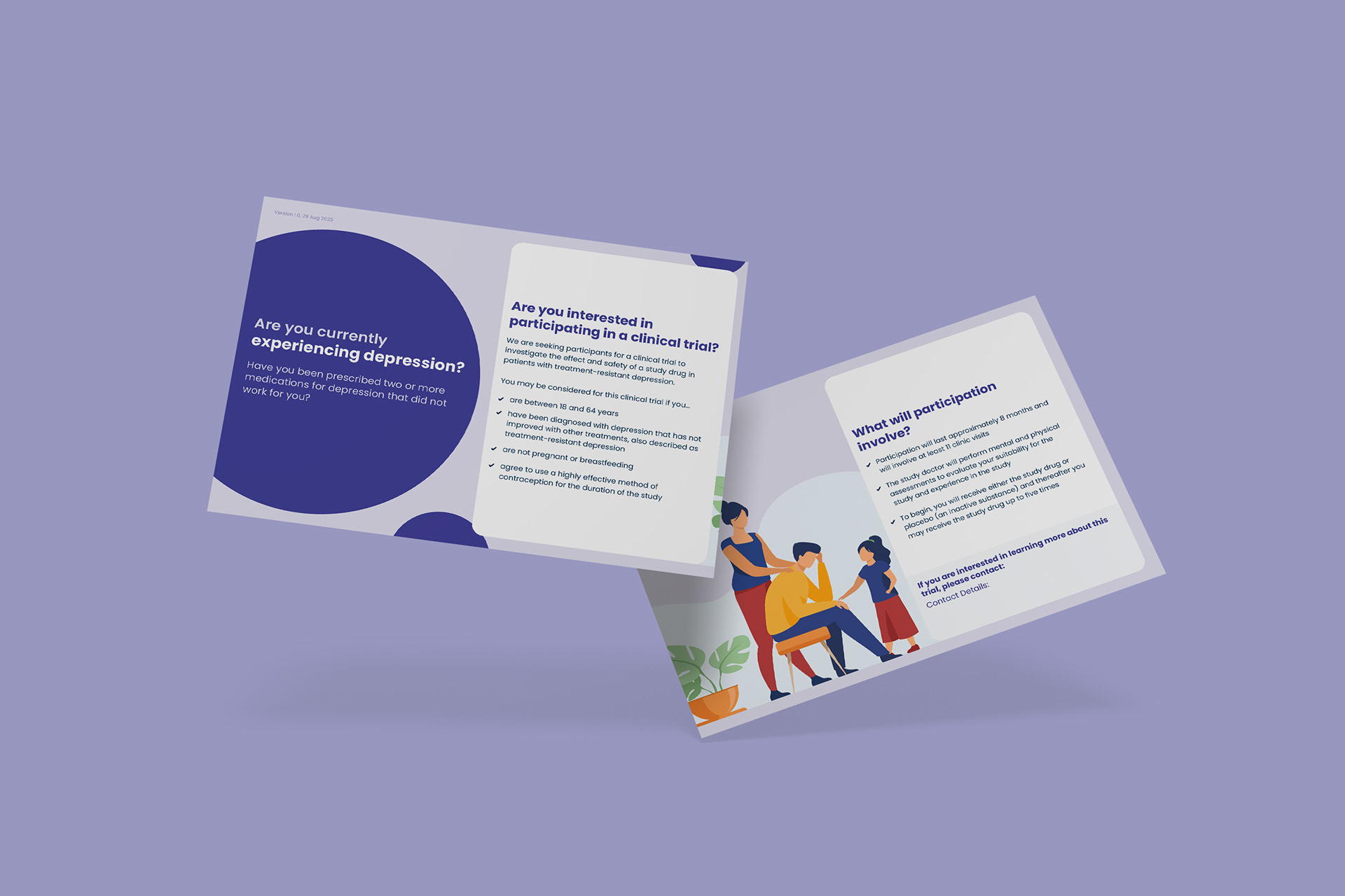
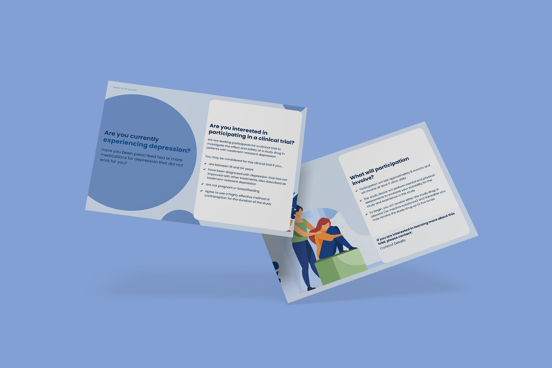
TRD Postcard
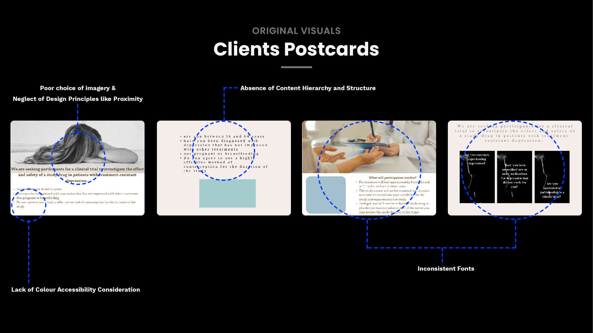
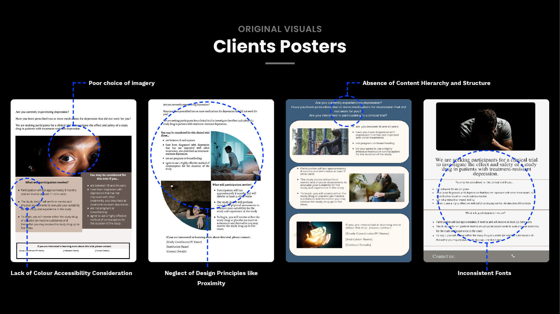
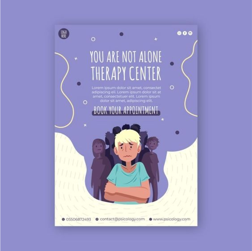
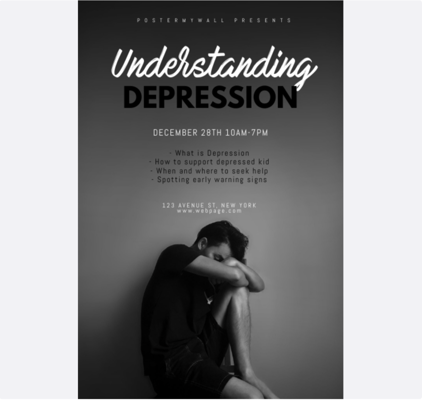
Client's Initial Attempts
The client's initial attempts at designing campaign materials encountered challenges such as colour accessibility issues, inconsistent fonts, and lack of content hierarchy. Additionally, their posters conveyed a somber and typical tone, which risked making them unapproachable to the intended audience.
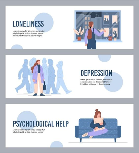
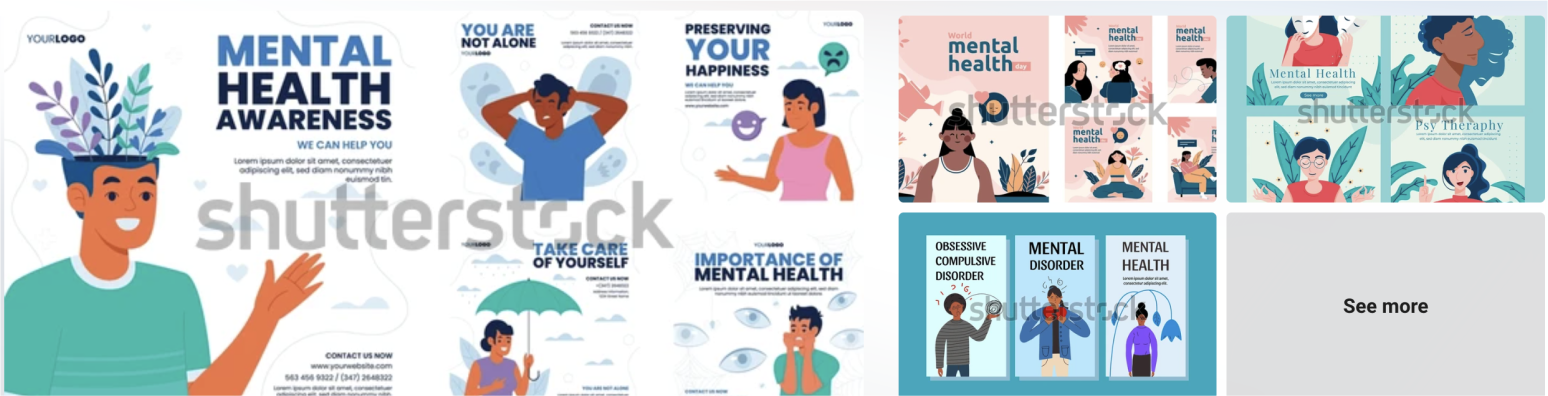
Research and Ideation
Research into market trends and preferences within depression-related campaigns included analysing designs targeted at different age groups. These insights informed and guided the subsequent ideation phase, ensuring outputs were tailored to two distinct demographics.


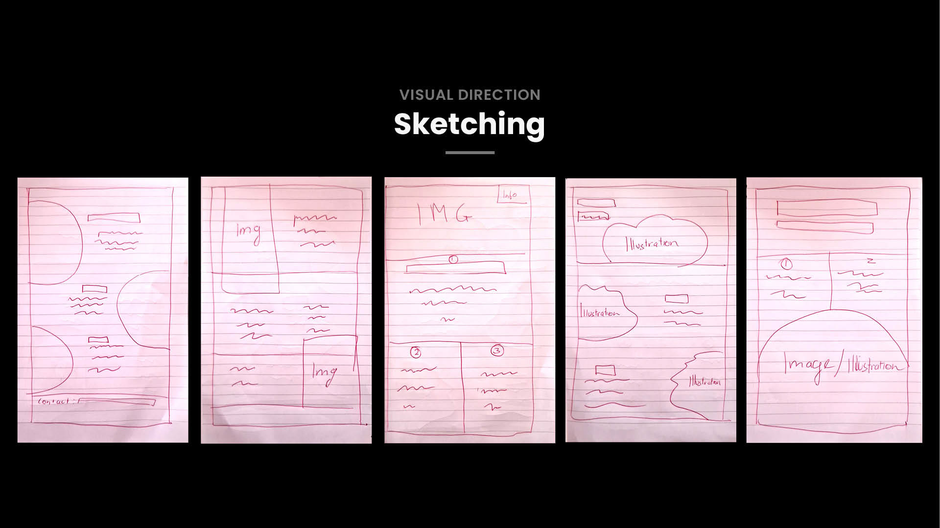
Sketching
Sketching was key in quickly visualising layout concepts, helping me refine designs before digitising them.
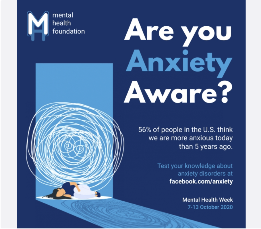
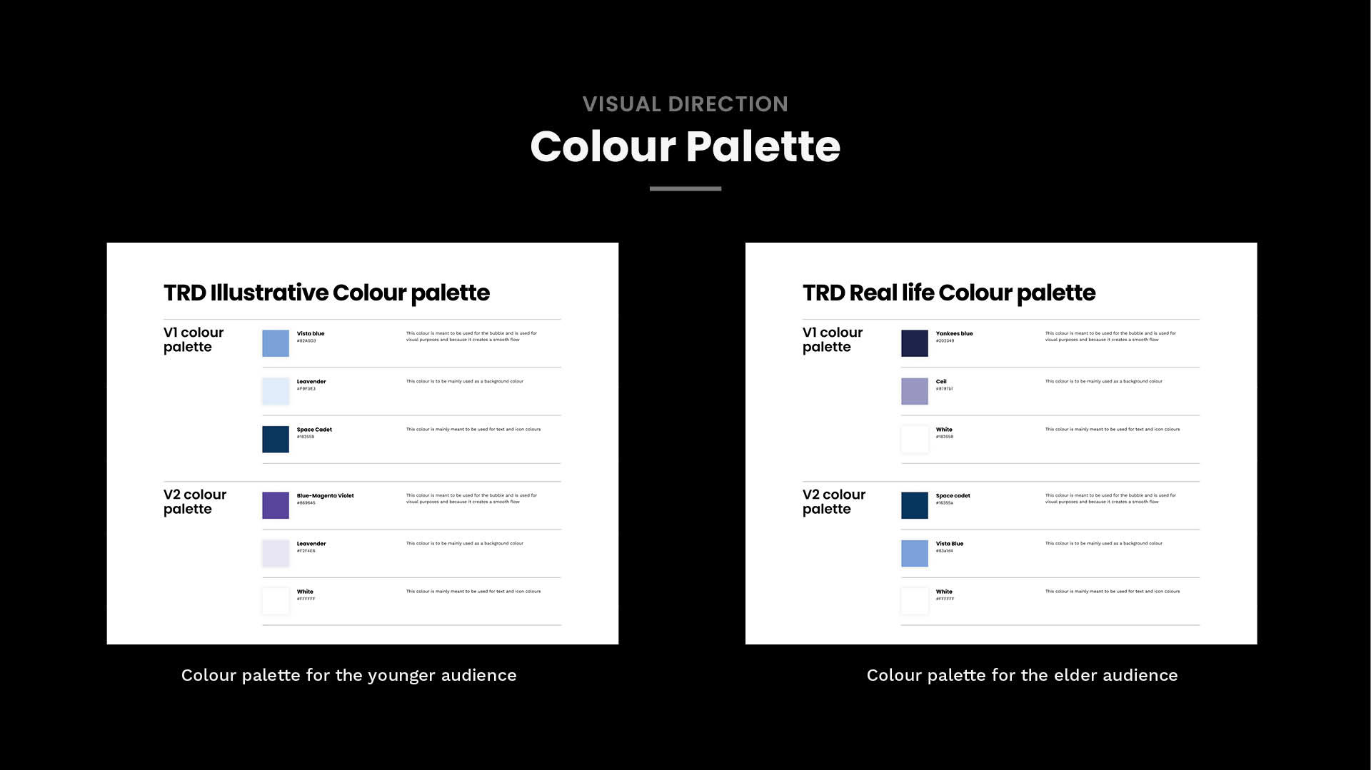
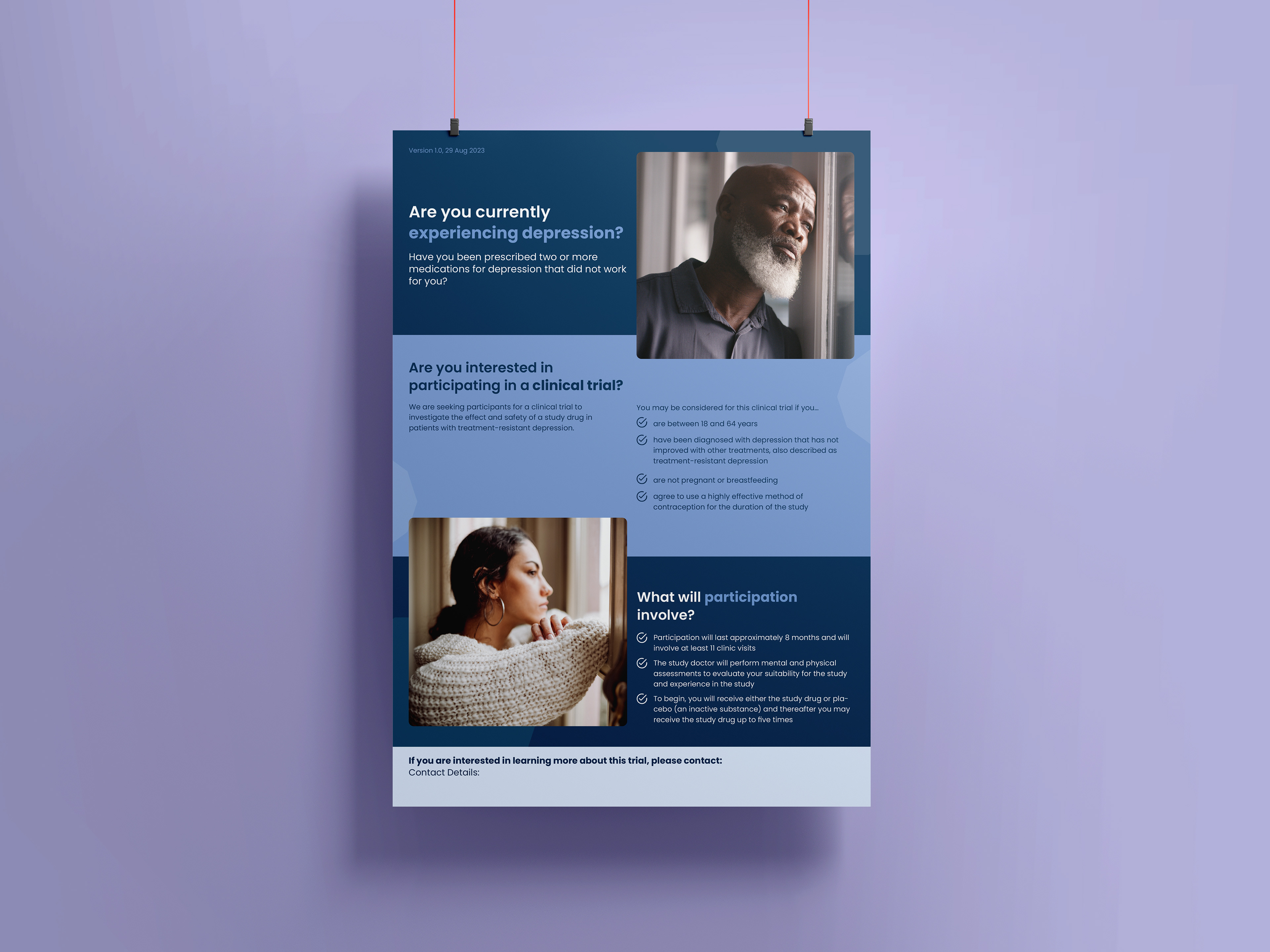
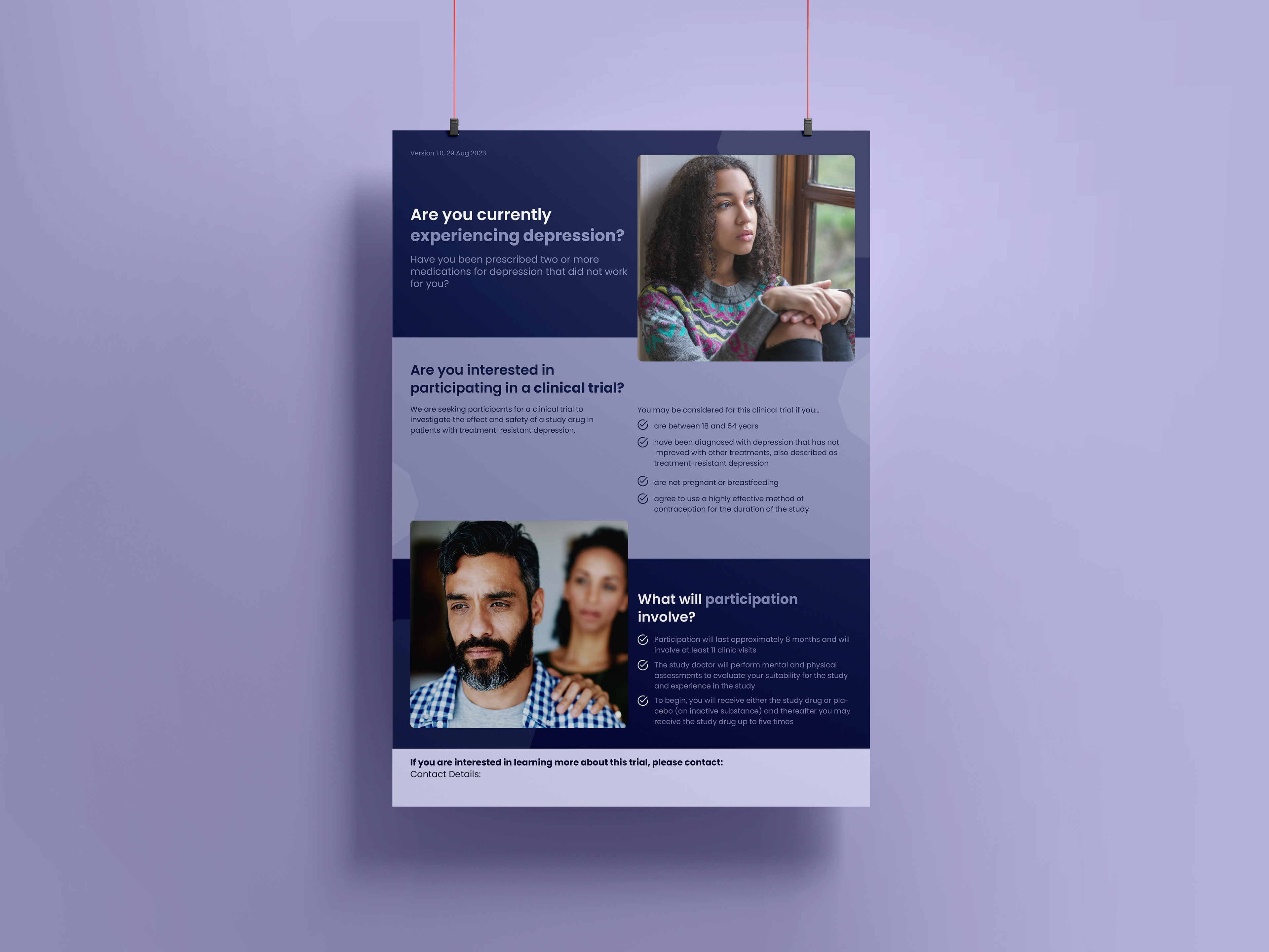
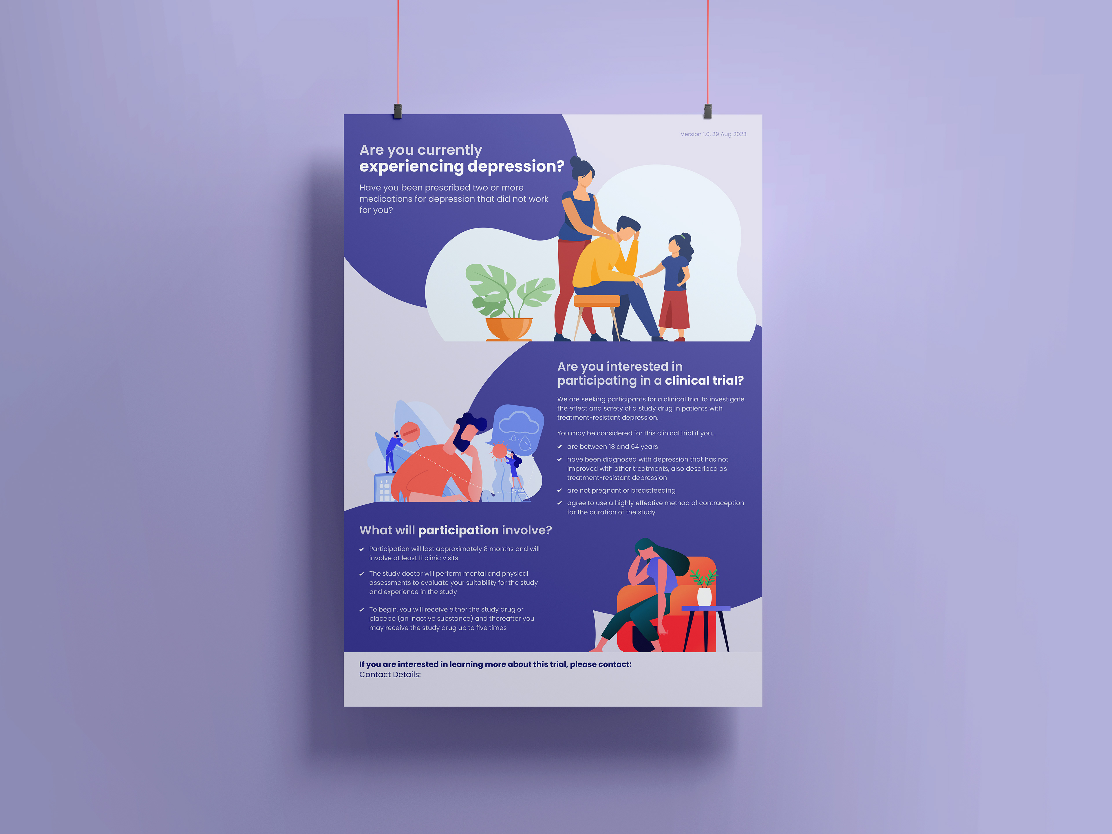
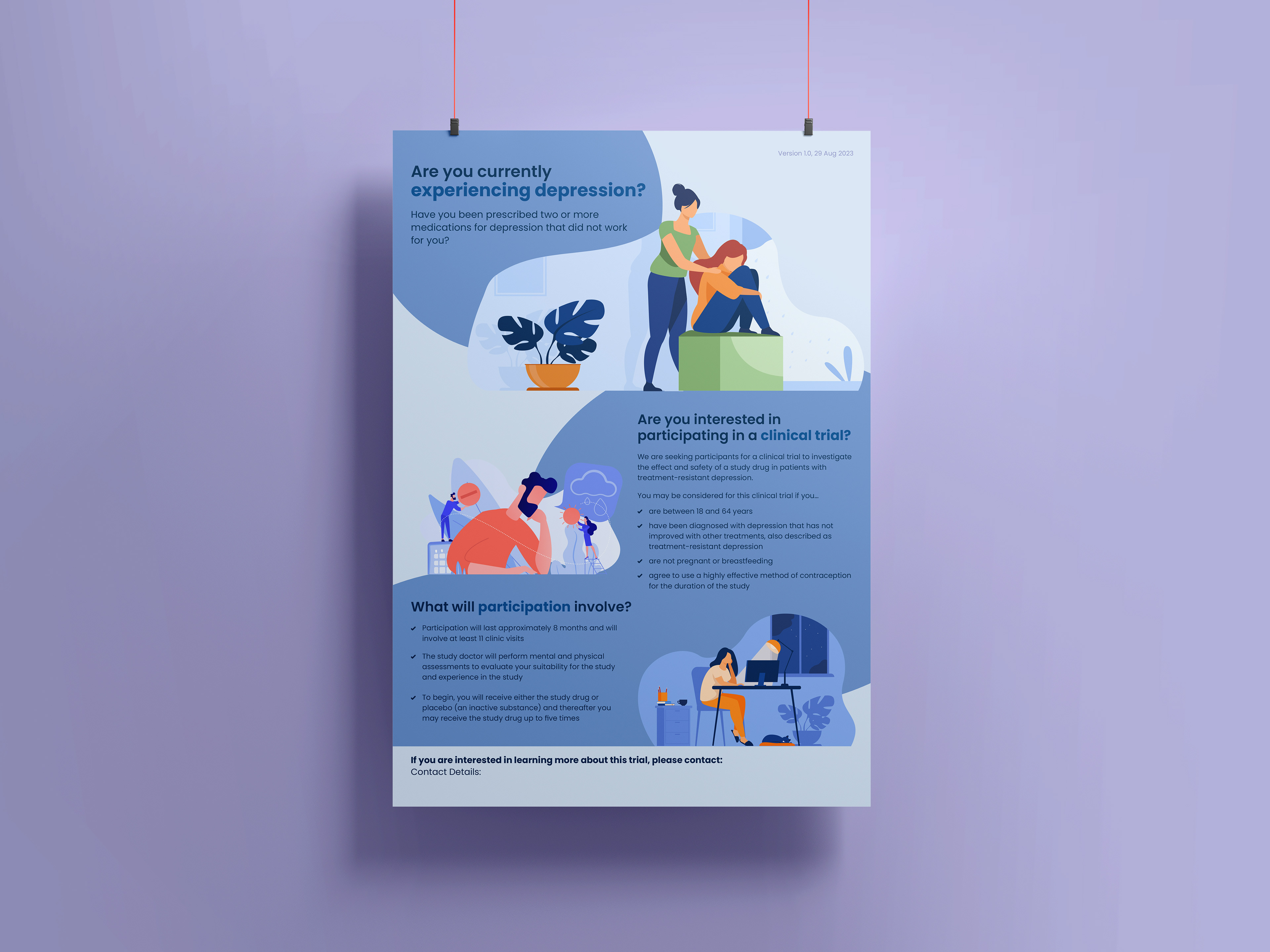
Setting Colour Palette
I selected colour palettes based on extensive research into colour theory principles and the emotional impact of colours. I opted for pastel tones to resonate with the younger demographic, while darker hues were used to appeal to older audiences. I found that blue, purple, and white were particularly suitable colours, reflecting hope and encouragement.
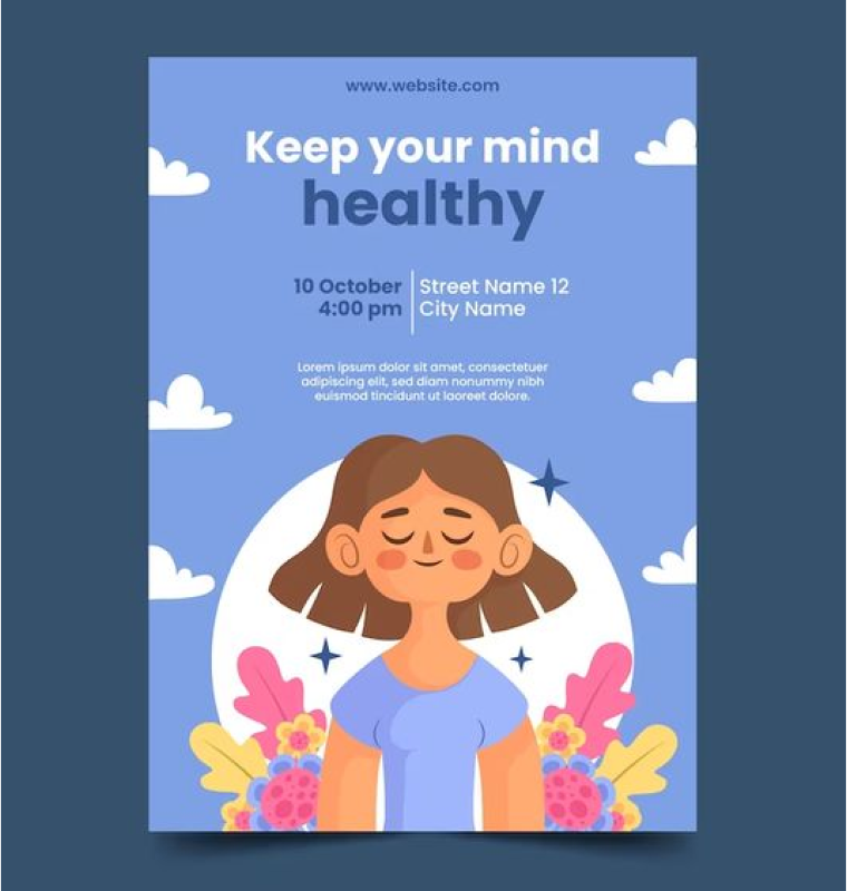
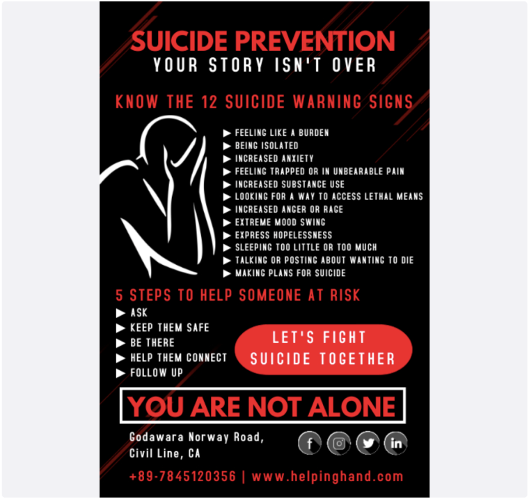
Final Designs
My final designs were crafted after multiple iterations and layout considerations. I explored various design options and refined them based on client feedback and project objectives. Through careful refinement and attention to detail, I polished the designs to effectively convey the campaign message while maintaining visual appeal.
Reflection and Success
Reflecting on the project, I learned valuable lessons regarding the importance of thorough planning and consideration in design projects. The success of the project, marked by client satisfaction in the initial presentation, highlighted the effectiveness of my meticulous approach. This rare outcome in the design industry of not redesigning concepts emphasised the significance of my comprehensive research and thoughtful design execution in achieving client objectives.